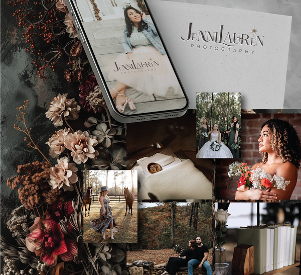
THE BRIEF
The client was looking to refresh her existing logo with a design that better reflected her evolving brand. She wanted a look that captured the essence of dark academia — refined, moody, and timeless — while still feeling authentic to her photography style. The goal was to create a logo that would feel both artistic and professional, resonating with her creative audience and elevating her overall brand identity.

THE OUTCOME
I developed a refreshed visual identity that embodies the client’s dark academia aesthetic through an elegant balance of rich tones, custom typography, and subtle vintage influence. To add a personalized touch, I incorporated a small design detail resembling a camera flash within the logo — a nod to her craft and a visual cue that adds depth without disrupting the minimal composition. Alongside the logo, I created a comprehensive mood board and color palette to guide future branding, ensuring consistency across her website, social media, and print materials.


The client was a natural beauty brand asking for a full branding project.
She wanted to use soft colors, a snake symbol, and a clean aesthetic.
Full Branding
Self Healing Beauty
Aesthetician & Beauty focused on natural and clean healing
THE BRIEF
The client approached me to develop a complete branding package for her new skincare line. She envisioned a clean, modern aesthetic with soft, natural colors and wanted to incorporate a snake motif as a symbolic element. While she had a brand name and a general creative direction in mind, she was looking for professional guidance to bring her ideas to life and create a cohesive, elevated visual identity.

THE OUTCOME
I created a custom hand-drawn snake illustration that became a defining element of the brand, developing several color variations for flexible use across packaging and digital platforms. From there, I built out natural, organic design elements and a soft, cohesive color palette to reflect the brand’s clean and calming aesthetic. The result is a versatile identity system that feels fresh, elegant, and perfectly aligned with the skincare brand’s vision.
.png)


